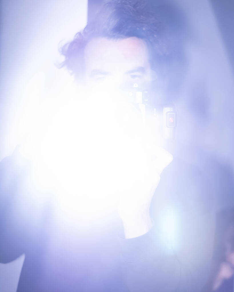
jurgen maelfeyt Art Paper Editions
Courtesy of JURGEN MAELFEYT

Jurgen Maelfeyt: starting where the silence breaks

jurgen maelfeyt
Art Paper Editions
JURGEN MAELFEYT
Lips
jurgen maelfeyt
Art Paper Editions
PIPPA GARNER
Personal Ads

Gent-based publisher Art Paper Editions isn’t just making books—it’s reshaping how we move through them. At the helm is Jurgen Maelfeyt, who’s been at the forefront of the imprint for over a decade, quietly blurring the lines between editor, curator, and artist. His approach is rooted in conversation, often paring down thousands of images into a tactile narrative that feels more like a collaboration than a product. Think less “coffee table,” more “field notes from the inside.” Whether working on the ongoing Monogram zine series or dashing between international book fairs, Maelfeyt rarely sits still. In this interview, we speak about the in-between moments, the art of not starting at the beginning, and why traditional formats might just be the least interesting part of publishing.

hube: You launched Art Paper back in 2010, tentatively at first. What were those early years like? What does it take to build a publishing house from scratch?

Jurgen Maelfeyt: I started out making my own zines. Then one of my clients—someone I was making a book with—asked if they could put my name down as the publisher. That’s when I decided, almost overnight, to start a publishing house. That became Art Paper Editions. In the beginning, I thought I’d publish maybe two or three books a year—mostly my own work, and perhaps something from someone else. But I got into the book fair scene pretty quickly. That same year, I was invited to the first Offprint in Paris, and from there, I realized how enjoyable it was to make books. We started doing more fairs and traveling to other cities. About two years later, we went to New York for the first time. That trip changed things. From that moment on, I began to think of Art Paper Editions as something bigger. We got international distribution and I started to learn more about how book distribution works. Over time, I decided to split up the distribution—now we work with around eight different distributors in various countries. I think it’s important to have local representation in key countries because those people know the bookshops best. At a certain point, publishing and distributing books became the main part of my practice. After all, it doesn’t make sense to make books that no one can buy.

h: If someone had never heard of APE, how would you describe it now—fifteen years on?

JM: APE is an independent publishing house focused on photography and design with a bold visual identity.

h: The Monogram series has become a bit of a signature for you. What does it mean for an artist to have a “Monogram”? How do you strike that balance between their visual language and your curatorial voice?

JM: I started Monogram because I felt there was a gap between the thing that I started with APE, which was making zines, and what APE was at that moment a few years ago, which was mainly focused on making artbooks, and those books were becoming bigger and bigger. So I felt the need to do something more fast-paced. And I don’t like coffee table books anyway.

h: When someone comes to you with a body of work, a collection of photographs or an idea—what pulls you in? What makes you say yes?

JM: Most projects come from people I meet or have conversations with. The most important question I always ask myself is: can I make a book out of this body of work? Sometimes we even talk a few times before I start on the project. For example, with Paul Kooiker we spoke for a year about what kind of book we’d be making before I sat behind a computer and started the edit or design. Of course, I also receive a lot of submissions by mail—people often send me already designed books. But I prefer when they just send images, so I can imagine the book myself. What gets selected from there is very subjective. There’s no fixed rule, but I have to see if it feels right for Art Paper Editions. That’s really what it comes down to.
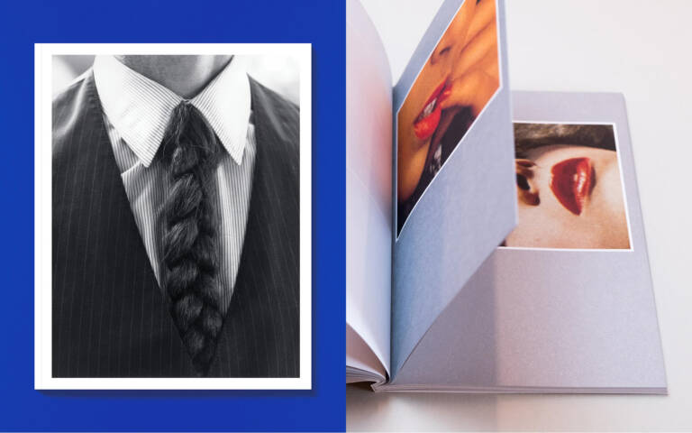
h: You’re known for your eye for editing—cutting a collection down by half, sometimes more. What stays? What goes?

JM: It’s a misconception that you have to edit a book from beginning to end—unless, of course, there’s a very clear narrative. Many people do go through a book from page one to the last, or the other way around. But a lot of people pick up a book and open it somewhere in the middle. That’s a really interesting aspect to consider during the editing process.

You need to have something engaging at every point in the book. That’s usually how I approach editing: the idea that the viewer might enter the book at any moment. So the project needs to be readable and compelling from multiple points within. That’s why the selection process is so important. It’s not just about choosing a sequence of strong images—it’s about selecting images that invite the reader to keep looking

h: What about when you publish your own work? Is that process more vulnerable—or more freeing?

JM: I’ve been publishing my own work from the beginning. It’s just part of my practice, and I want to keep doing it. Since I have my own publishing house I can decide whenever I want to make a book, that’s the freeing part.

h: Toy and Wet both tap into found imagery, a different kind of authorship. What draws you to that kind of material?

JM: I have a weak spot for printed archival images, especially from the seventies. I collect all sorts of printed matter from that period: manuals on gardening, books on precious stones, plants, amateur erotica, Playboy, Lui Magazine, etc. I think what draws me most to that period is the use of colour. Even in instructional books, every photo is carefully composed. If you look at books about plants, for example, each plant is photographed in a completely different setting. There’s a real attention to detail in that kind of photography. These kinds of publications slowly disappeared during the eighties. In more erotically themed publications or magazines like Playboy, you also see how colour plays an important role—alongside the abundance of clichés. That’s the kind of material I love to work with, to reinterpret, and in doing so, make my own. 

h: You’ve had a long-standing collaboration with Richard Kern. How did that relationship start, and how has it evolved over the years?

JM: It’s not only about Richard Kern. I have a very good relationship with many artists. I think it’s because making a book is a very intense but also a very intimate way of working together. At a certain moment, you become friends with that person or artist, and you do more than one project with them. For me, that’s very important in how I work.

h: You’re a regular on the book fair circuit, and your launches in Paris have become staples. What’s next for APE this year? Anything you can share?

JM: APE is celebrating its 15th anniversary this year, so we’ll be marking the occasion this autumn. We’ll be present at both Offprint Paris and Paris Photo, which I’m really looking forward to. There are also many new titles coming up later this year—around 10 to 15. As always, we’ll be introducing a few new names as well. One of them is Carla Rossi, with whom I’ll be publishing Bellissima. Another is Provisoria by Ria Verhagen—a collection of nearly 4,000 newspaper clippings gathered over the past 30 years. We’ll also release Erotish 2 by Julia & Vincent, a follow-up to the first publication. Just to name a few. Our fall catalogue will be launched beginning of July.

jurgen maelfeyt
Art Paper Editions
RICHARD KERN
Polaroids
jurgen maelfeyt
Art Paper Editions
JURGEN MAELFEYT
WET
jurgen maelfeyt
Art Paper Editions
JURGEN MAELFEYT
Sister Sister
jurgen maelfeyt
Art Paper Editions
PAUL KOOIKER
Fashion

By JULIA SILVERBERG