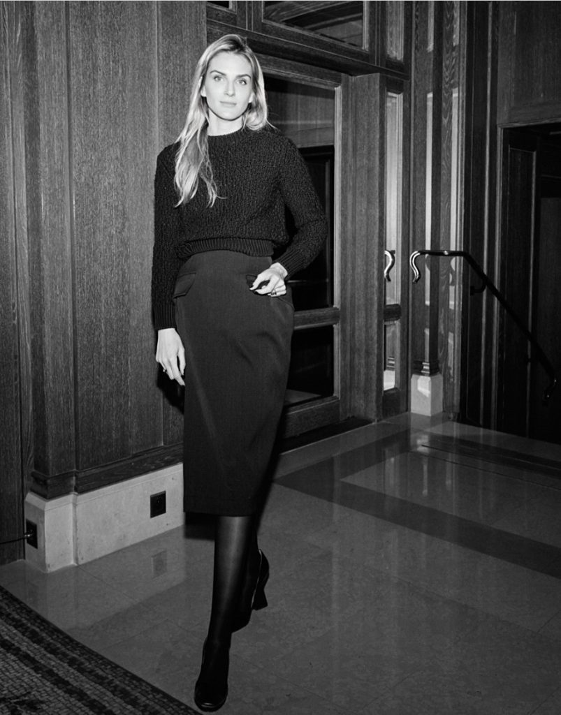
Gaia Repossi, an Italian-born and French-raised jeweller and Creative Director, boldly reinterprets the pearl, transforming this timeless gem into a provocative symbol of contemporary identity. Far from merely embodying purity, her designs intertwine elegance and audacity, creating a narrative that celebrates the complexities of modern femininity. Each piece becomes a striking statement – a harmonious blend of tradition and innovation – that encourages to embrace individuality. With Repossi’s signature aesthetic, the pearl emerges as a dynamic canvas for self-expression, reflecting a dialogue that challenges conventional beauty norms.
hube: In Limited Edition №5, you’ve reimagined the pearl – a symbol of purity and elegance – with a dark, modern edge. Was this an act of rebellion against tradition, or does it speak to something deeper about how we view beauty today?
Gaia Repossi: It’s a way to rethink classics with my own signature and stylistic codes applied to a classic take.
h: Your father, Alberto Repossi, mastered the pearl in the 1990s, yet you’ve chosen to twist its meaning for today’s audience. Do you feel you’re in dialogue with him through your work, or are you shaping something completely different?
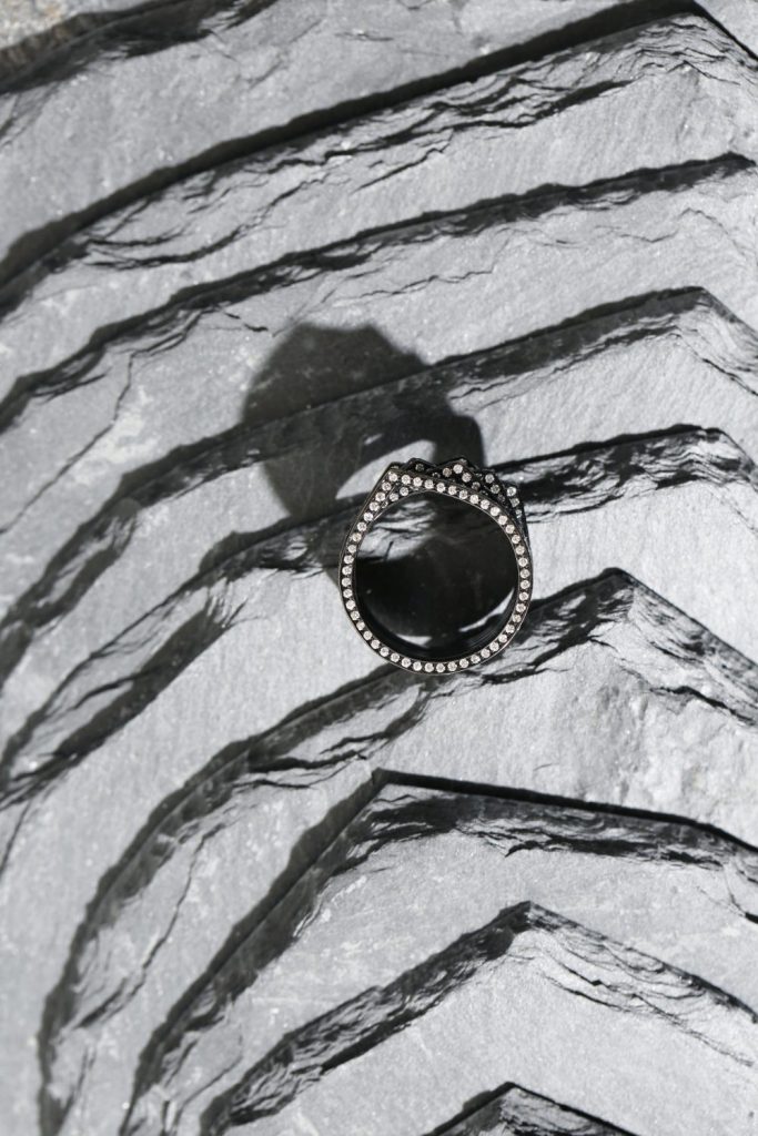
GR: Absolutely, my father had a vivid influence on my choice of stones; he educated me and trained my eye for both stones and pearls. The pearls chosen for the ring reflect his taste for exceptionally high-end pearls, more aligned with mid- to high-end jewellery than with bourgeois codes. His love for pearls influenced me deeply – I remember him sourcing entire sets with perfect pearl gradients in necklaces, whose elegance and harmony made them extraordinary.
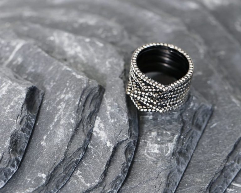
h: The concept of the ‘floating diamond’ is iconic within your Serti Sur Vide collection. With Limited Edition №5, do you feel like you’re allowing the pearl to ‘float’ in a similar way? How does this echo the tension between permanence and transience in your designs?
GR: The pearl floats and is positioned in a way that makes a statement. They are arranged like diamonds to create an elongating effect, giving the illusion that you’re wearing only the pearls in a very elegant, surprising, and modern manner. Once again, the goal of this piece is to captivate through unexpected placement, a technique that draws the eye. It embodies the brand’s signature and my own design identity.
h: Your designs always seem to strike a balance between minimalism and grandeur – what you’ve called Art à Porter. Do you think jewellery today needs to provoke as much as it beautifies, and how does this new piece challenge the wearer?
GR: It’s definitely designed for the final illusion once worn rather than as a beautiful object to look at when displayed. Its minimalism allows for a very dramatic display. Still, the magic happens when worn – a statement and a moment of grace for the person wearing it and a moment of elegance paired with a contemporary edge. To me, it’s a timeless piece, which is essential when creating jewellery, but as a designer, there is also the discipline of anchoring it in our time by reinventing codes.
h: The dark grey Tahitian pearl next to the larger light grey one – there’s a palpable tension there. Are you playing with dualities? Does this say something about the modern woman’s identity – refined yet bold, timeless yet constantly shifting?
GR: The piece’s personality is definitely given by its balanced contrasts and rhythm. There’s a delicate, feminine elegance with the white, and the gradient intensifying toward greys and blacks gives the piece a gradual strength.Nowadays, women’s femininity is constantly questioned and challenged by daily wear and new positions women hold in the world. So, absolutely, my jewellery is designed with these paradoxes of femininity and modernity in mind. That’s why it appeals to and speaks to all genders.
h: You once said your jewellery is for women who won’t wait to get engaged to buy a ring. Are you designing for rebellion? How do your pieces embody autonomy in a world that still expects conformity?
GR: The idea is to redefine classics, so the engagement ring comes into that study where designs are rethought, and the engagement ring’s style is reconsidered. Does it need to be a solitaire, or can the ring reflect the chosen values and design? This trend has been noticed, where the dream engagement ring for some women is far from the traditional solitaire; instead, it has a bold and strong design. The investment is then directed toward a ring of their choice, with new standards that break away from conventions.
Similarly, solitaire rings are no longer considered only for engagement but as a beautiful ring to own. If societal standards change, jewellery must follow.
h: Working with Rem Koolhaas, and even curating furniture by Flavin Judd for your stores, you seem to break the boundaries between architecture and jewellery. Do you see your stores as installations, or do you think the jewellery transforms the space itself?
GR: What I design is produced on a very small scale, so the environment where it is presented is, for me, a key experience. A luxurious environment alone is not enough; I wanted to present it in a bold and interesting setting that matches the designs. That’s a real luxury for me – beyond the excitement and enrichment of collaborating with such personalities and aesthetics who also rethink their surroundings.
h: Anthropology and architecture shaped your academic life before you stepped into the world of jewellery. How do these seemingly distant disciplines feed into your designs? Are your pieces artefacts of a forgotten future?
GR: Jewellery is an applied art, not just art, ruled by design principles that require perfectionism, technique, and knowledge. This includes the need for certain key design principles that require timeless characteristics, anchored in time, etc. However, I personally also love echoing the past, and my studies have filled my background with ancient or tribal references, influencing my visual aesthetic and knowledge, and therefore my designs.
h: Your collections evoke a sense of history but feel ultramodern – stacked rings that ‘climb like scaffolding,’ as you’ve said. Are you building monuments to the past, or are you creating the architecture of new myths?
GR: Definitely, stacking, or the pre-stacked concept, is a tribal and ancient accent that echoes past civilisations and tribal remnants that I apply with modern and minimalist designs. The idea is to create new classics this way, which is considered an important challenge in design.
h: Risk seems woven into your process. Whether it’s using an unconventional photographer like Juergen Teller for a jewellery campaign or taking bold material leaps, what’s the thrill? Is it about disrupting expectations, or is it about constantly surprising yourself?
GR: It’s about surprising the audience rather than myself. Because jewellery is still a virgin terrain to break certain conservative precepts, it’s easy to find ways to surprise, yet in an elegant way.
h: With your recent sponsorship of the Brancusi exhibition at the Centre Pompidou, how do you view the role of art in shaping cultural narratives today? What drives your connection to art as a brand, and how do you see these artistic partnerships enriching both the fashion world and broader creative dialogues?
GR: I think brands supporting art foundations and museums are evident; it goes without question that the partnership allows infinite inspiration and historical links in building the future. It’s our duty to preserve the past to create the future.
Photography courtesy of GAIA REPOSSI