Jan Bajtlik calligraphy poster art
JAN BAJTLIK, sketching Mont Blanc from the refuge Grand Mulets, 2024

Jan Bajtlik: rethinking poster art through heritage and experimentation

Jan Bajtlik is an award-winning multidisciplinary artist whose work spans drawing, painting, illustration,  as well as a wide range of mediums and canvases, garnering international recognition and acclaim. He has received silver and bronze medals at the International Poster Triennial in Toyama, special mentions at the Bologna Ragazzi Award, as well as a special award from the Polish Ministry of Culture, among other distinctions. Bajtlik has also participated in over fifteen solo and group exhibitions, including Paris Design Week and the Cité Internationale des Arts.

Since 2016, Bajtlik has maintained an ongoing collaboration with Hermès, designing silk scarves and fashion accessories, as well as projects for Hermès Home, including the realization of window installations for the brand’s first Warsaw location and reopening of Dubai boutique. His drawings and illustrations have appeared in print publications such as Vogue Poland, Time Magazine, and The New York Times, in addition to authoring his own books and publications. Though deeply inspired by heritage, culture, and tradition, Bajtlik’s work maintains a sense of untethered transcendence, with designs that feel both referential and futuristic — seemingly immune to the passing of time and the confines we assign to it.

hube: Your influences span thousands of years and multiple visual languages—from cave markings to calligraphy to street art. What is it that holds these worlds together for you? 

Jan Bajtlik: It’s all about something really basic—something really vernacular, deep inside of our instincts—something which pushes us to create things. Calligraphy or historic drawings or street art operate as graffiti, ‘off scene’, something less official. They operate with very simple forms, and they gather enormous expression. Of course, we see these factors in other centuries and nowadays in contemporary art, but they gather some essence, and there is an amazing force behind this. It is always inspiring to me how we combine this practice of ‘less is more’ in different forms—black and white painting or drawing, something in between calligraphy and image itself. Something which I could also refer to later between design and art. Pure art.

Jan Bajtlik
calligraphy
poster art
TOKYO METRO at DOVER STREET MARKET GINZA
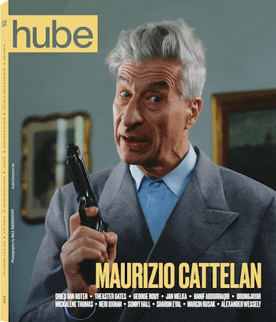
Photography by WATARU FUKAYA, 2024
Jan Bajtlik
calligraphy
poster art
Painting for the Chinese Year of the Fire Horse, 2026
Jan Bajtlik
calligraphy
poster art
JAN BAJTLIK
L’Aiguille Verte, Les Drus, Mer de Glace, Grandes Jorasses, Dent du Geant, 2025
Jan Bajtlik
calligraphy
poster art
CHEVAL MASQUE original painting, work in progress, 2025
Jan Bajtlik
calligraphy
poster art
JAN BAJTLIK
Saint George and the Dragon, 2021

h: What was the catalyst for you for getting into this field of work? What made you really feel that this is for you and what was that final step into doing it?

JB: Perhaps it came quite early because, when I was preparing for the exams at the Academy of Fine Arts as a teenager, I was fascinated with and influenced by Polish poster art. There was a movement in Poland in the fifties, sixties, and seventies which was called the Polish Poster School. It was a generation of artists who, after the war, were creating absolutely amazing works. Most of them were painters; they were taught as artists. They graduated from fine arts. They were not designers like in Switzerland, France, or Germany. It was a completely opposite way of practice from the West. 

They were facing the problem of technology, the problem of lack of materials, and trying to do something from nothing, contrary to Swiss designers. It’s very well reflected in the typography. They were using handmade typography, something really rough, and it had the intention to be expressive, but just to find its place within the work of the materials, the limit of the colour. It set up a workshop which was, we would say, was ‘rough’ or ‘off art’, but it gave a lot of beautiful expression. Something really emotional, something really rough, but put in a way which, artistically or informally, is very interesting and very rich.

The other problem was that they had to find their own language through metaphors because they were facing censorship. They were escaping to present other messages, hiding somehow in a form, in a shape, in the connections and metaphors. The posters were connecting everything for me; it’s a rectangle, horizontal or vertical. It’s a classic proportion in our culture when we think about the image, and it gathers everything: painting and drawing, the composition, color, typography, message, the essence of visual language. You need to find the essence to communicate the message, but at the same time to put it in an interesting way. It can be ‘less is more’, but sometimes it can be even more decorative. Still, it should gather your attention and communicate something really quickly. I was so amazed by this heritage, and I thought that it was some kind of art which was inaccessible. It’s so hard to do something like that. It inspired me to think and to watch carefully what was in the past through these designs, and to try to find my own way to face all these very basic issues of creating an image and finding my own visual language.

h: What can be learned from heritage—and, in the same vein, how can we, with care and reverence, choose which elements to relinquish in order to move forward?

JB: Heritage doesn’t mean that you need to stay in the past. It’s rather a library, a museum, where you can realise that all the things which happened in the past are still relevant and still very vivid. They were put in a context of something closed, physically closed in the museum or the library, but they are still alive. Our culture is based on nonstop reference; it’s a long history of referring to one another, a long discussion through hundreds of years. We can play with it. If we think more about reinterpretation and inspiration than trying just to evoke a preciseness, it’s much more interesting. This is how our richness was built, and it’s still moving. I think it’s accelerating more and more. We have more access to everything, physically and digitally, and we spread information much faster than before. Perhaps it’s creating chaos, but at the same time it’s a wonderful time to find your own way and to find a new quality.

h: When you look ahead, what feels most exciting—or urgent—about the future of art? And where do you see your own journey moving within that landscape?

JB: I would say we have more possibilities and access than we had before. It should create new opportunities. That’s why I’m less excited about AI. We adapt constantly, and the changes are coming faster than we realise. Perhaps that’s why we think that we are in chaos or uncertainty. But when you look at history, there were so many periods where the situation was much more dramatic, much more chaotic, and where planning was almost impossible. I think the amount of information and access can be treated as an exciting way. This is also a kind of drive for me every day when I wake up; I’m curious what will happen today in terms of what I will see and how it’ll impact me for the next project. You need to find your way to deal with this amount of inspiration, but I think we should look at this more as an advantage than a curse.

Especially now, when you see what’s going on between the digital world, social media, and what’s happening in museums and design, everything is somehow received. It doesn’t mean that everything has an interesting quality. Perhaps at times it looks better digitally than in real life.

h: Your work moves freely between media—ink, paint, textiles, books, public space. How does your vision shift when the medium changes? Do materials guide the story, or does the story decide the form?

JB: Every form, every medium gives you a different type of expression. On one hand, you can choose the right medium to express a feeling depending on the impact and the force you would like to use. In the process of creation, the most interesting thing is always to go forward. I was always interested in many things. This is how I grew up, this is how I was educated, and for me this kind of diversity in life—the constant change—was present. The people I was spending time with were coming from very different environments and doing different things. It’s a richness. But you need to find yourself in it somehow. You need to have real passion which guides your life.

Perhaps this is why I use very different styles or techniques for different reasons, because of the amount of interest I have in the world and the positive energy in it. With different media, you want to do something in black and white or ink or whatever, but then you think, ‘what if I try this in a different technique? I was attached to it in the first moment, but maybe when I change to a different medium, it’ll give me a different result’. This is what I hope. This is one of the methods for developing skills, imagination, and yourself. It’s a constant movement of going two steps forward and going backward all at the same time—self-criticism, revision. Try not to stay in one place all the time, physically where you live, but also in how you work.

I was always inspired by artists and by people who were doing different things. When I was a kid, I was fascinated by Leonardo da Vinci and Picasso. They were doing many things at the same time. I know this example is super cliché, but it is a really good example of artists who are diverse. What attracted me was that they were playing with it. They were clearly evolving themselves with different mediums, but they were also playing with them. They were constantly trying to go out of their comfort zone, but in an intelligent way, still keeping their own thing in mind and in their spirit.

When I was looking at art albums, I used to go from one page to the other, seeing several paintings, and then the same person doing drawings or paintings in black and white or another medium. For me, it was a kind of codex that all of these great masters were trying to reinvent themselves through other mediums. Sometimes these less known forms were even more interesting than the main one. It’s necessary and it’s the base for development and creation.

If I’m stuck somewhere and have no idea, I try to pass this moment. Not to panic, not to react nervously, not even physically, but to stay in the process. To pass this moment and understand, ‘you have already been here; you have already passed this situation several times’. It’s hard because, by nature, I’m nervous and impatient. One of the teachers who taught me drawing said, ‘if it doesn’t work when you draw the right hand, try the left one’. It’s also kind of a metaphor, so you need to put something upside down. There are several formal, technical methods for dealing with moments when you’re stuck.

h: Text and symbols appear throughout your practice. How do words work alongside image for you—do they anchor meaning, complicate it, or open new pathways into it? 

JB: I work less and less with text because I used to do books and book design, but I still do quite a lot of narrative work. Referring to my work with Hermès, art director once told me that ‘silk is a text on a textile’. You have a visual story which is as dynamic, rich, and as interesting as a text. This is a straightforward description of it. 

This also refers to what we said about heritage and ancient art. When you look through history, you find many representations that were almost like animation. You had sequences of images presenting the story, the movement of the characters, the change in scenery, the landscape. This is something that has really inspired me. I was never very interested in comics. I was more interested in medieval paintings showing the life of someone and storytelling through images. You could separate every image as a single piece and then gather them like a puzzle.

Even if I work on a single image, like a scarf or something else, I think that any small detail can be a separate scene, but it should gather well within the whole composition. From book design and poster design, I learned that in a book, every spread, when you open the pages, should work like a poster. It should instantly send a message through expression and composition and through organisation. At the same time, it should be coherent and work well with the next sequence. This is something we have in film and photography—it’s very basic, but it gives you many possibilities. It’s really exciting.

h: You’ve collaborated with Hermès since 2016, working across scarves, fabrics, ceramics and more. How did this relationship begin, and what have you learned from entering a house with such a strong heritage and visual language? 

JB: It was the right moment in the right place in my life. It’s already 10 years now that we have been collaborating, and it somehow dominates my practice, but in a very positive way, because I don’t treat this work as ‘work for someone’, for a ‘client’. Hermès is not a client. They are more like partners or producers, editors, someone who prolongs your vision or shows your vision in a different light.

I was contacted by the art director who saw my exhibition in Paris, where I was presenting mostly posters. It was a festival of graphic design, which doesn’t exist anymore, called “Fête du graphisme”. When we met for the first time, they didn’t ask me to do anything. They were more curious about me. They asked me to bring everything that I could bring. I showed them personal drawings, books, posters, everything that I had at the time after my studies in graphic design and art in general. They didn’t know what they could do with me. They knew there were many possibilities, but there was no first impulse; it wasn’t copy-paste. I was very interested in how they had time to think and draw things naturally.

After a few meetings, when we got to know each other better, they asked me, ‘maybe you can think about the square for the scarf’. I proposed a first drawing, and at the same time they asked me if I could do typography of letters rather than 3D shapes. From the beginning, I had two very different projects: one more related to graphic design and the other more to art or drawing. I wasn’t obliged to do anything. They didn’t ask me to refer to their heritage history. Through the first meetings, they showed me not only the archives and the museum they had. I was very lucky.

The previous director led me to visit other parts of the house. I was coming to Paris for a few days, and every day I had a meeting with someone else from the home department, communication, scenography or graphic design. In a short time, I realised that I was again in a kind of school rather than a corporation. It became a place where I could play and learn a lot at the same time. It went quite fast. We’ve done many very different projects, starting with scarves, different textiles, objects, scenography, jewellery, communication projects, all based, in my case, on images, painting, and drawing. Recently, in the last two or three years, they have adapted paintings I did on a large scale. For me, it was—and still is—the ideal place. I realised that I grew up with them, but I was never obliged or pushed to do something else, because it doesn’t work like that.

The first scarf “Animapolis” was a kind of visiting card showing the place where I’m from. I imagined the city of Warsaw mixed with different metropolitan areas. It was a real story based on a dream I had.

At the time, there was a huge debate about advertisements in public space. One day I had a dream: the whole city was completely devastated visually by huge banners and unregulated forms of advertising. I dreamed that I was walking through the centre of Warsaw and all these monsters and creatures from films came alive and emerged from the banners and advertisements. That was a metaphor which led me to show it on a scarf as a kind of imaginary city. 

Every project was and still is based on things that interest me at the moment. The way I change style reflects how I’m changing myself.  It’s placed within the frame of Hermès, and it took me time to start referring to their heritage in my own way. It also took time to realise that I could bring something of my own while taking something from them. Their heritage was, and still is, a very important source of inspiration that can directs a path.

Now, many people I work with are my friends from work and also friends privately. This environment has become important to me. The most intriguing thing is that they are very curious, open, and tolerant. They don’t expect something specific; they are curious to see how it will go. This approach feels natural—it’s not pretentious, it’s not planned.

I’m not French, but maybe for some people that creates curiosity. I’ve been living in France for five years, and I was always close to French culture. I did a stage here, and when I was a student, I did many exchanges and workshops. I already knew quite a lot of people here. I have the impression, when I meet someone, that they don’t always know what my origins are. My French is improving; I’m fluent, but not native. They don’t understand why I’m Polish and working in Paris. It’s a bit complicated. This puzzle is the result of curiosity, movement, and exploration. It created a cultural mosaic where I’m not attached to a professional path in Poland. I still have friends there and I’m from there. Especially in the last two years, it has helped me see many things in a very different light. I’m not French, but I do everything here. I live here, I work here. Most of my friends and clients are here. You feel like you’re suspended in the air, between France and Poland, between cultures. Chamonix itself is a crossroads between Italy, Switzerland, and France. This is an attitude I like. It gives distance, which is very important. 

Jan Bajtlik
calligraphy
poster art
JAN BAJTLIK
ANIMAPOLIS, 2026 
Courtesy of HERMÈS Paris
Jan Bajtlik
calligraphy
poster art
CHEVAL MASQUE original painting, work in progress, 2025
Jan Bajtlik
calligraphy
poster art
JAN BAJTLIK
CHEVAL MASQUE, 2026
Courtesy of HERMÈS Paris
Jan Bajtlik
calligraphy
poster art
JAN BAJTLIK
Drawing for TOKYO METRO art book
Photography by CALYPSO MAHIEU, 2024
Jan Bajtlik
calligraphy
poster art
JAN BAJTLIK
L’Aiguille Vere et les Drus, 2024
Jan Bajtlik
calligraphy
poster art
TOKYO METRO art book
Photography by CALYPSO MAHIEU, 2024
Jan Bajtlik
calligraphy
poster art
Courtesy of JAN BAJTLIK
Jan Bajtlik
calligraphy
poster art
Painting for the Chinese Year of the Fire Horse, 2026

h: You live close to the mountains and often speak about hiking as a core part of your life. How does nature affect your imagination and discipline? And does distance from big cities give you space to hear your own creative voice more clearly? 

JB: I am between Paris and here [Chamonix], so I’m not completely cut off from big cities, but I found this place to be a great place to work and concentrate. Most of the time I work, and this is a solitary activity—it’s like being a monk. It’s a daily routine. It takes a lot of time. You spend hours alone. I move quite a lot, going to Paris sometimes every week.

It’s a great place to concentrate. I do mountain sports, skiing, climbing, and paragliding. I do these activities, and also gather. More and more, this area gives me direct inspiration for drawings or paintings related to landscape or climate change. I’m surrounded by glaciers that are changing literally every day. Being part of this environment draws attention directly to these subjects, which are increasingly important to others as well.

The location between three cultures is very inspiring—it changes perspectives. Geneva is one hour away, Zurich three hours by train, Paris two and a half, Milan 4h by car. From my perspective, I have two centres of the world: here, where everything is close, and Paris.

I’m starting to find ways to reinterpret the landscape—how to paint it, draw it, and use it. I remember climbing in autumn and seeing, behind the mountains in the fields, ski-lift cabins placed on the ground during the seasonal break. Everything was orange and green, with white cabins next to each other. From a distance, it looked like a Star Wars army—something surreal. I immediately drew the scene and later made a painting. Then I became more interested in constructions hidden in the mountains, sometimes abandoned—old concrete lift stations between beautiful landscapes and structural pillars. I thought, ‘that might be it—that’s the way I can interpret it’. Also, I have long been very interested in 19th-century engravings and postcards depicting glaciers, which were much larger at the time, yet often shown in a hyperbolic manner through more fanciful drawings, and sometimes even using collage to further diverge from reality. It’s interesting from today’s perspective, as we live in a landscape somewhat poorer than that of a hundred years ago, yet still just as beautiful.

h: You recently spent time in Tokyo and released Tokyo Metro. What brought you there, and how did the city shape your way of seeing, working, and observing the everyday? 

JB: I always had this fascination with Japan, which started when I was a student and was interested in Japanese graphic design. There were many connections between Japanese designers and Polish designers through posters. I was participating in Toyama festival in Japan and I got a prize there when I was a student. I was very surprised because I got a silver medal in this very well-known poster competition; it was quite a lot of money for me. Immediately, I thought that I would spend all of this money just to go to Japan.

I had a great opportunity. I was invited by one of the great Japanese designers to live at his house in Tokyo. That was the first time I had the chance to discover Japan, already from a different, privileged perspective and had the chance to meet other designers I knew before through their work. Every time I was there, I tried to discover a bit more. It’s such a huge and complex subject that it’s not possible to understand it just when you go there for a short period of time. The most recent time, I had the possibility to spend six months there; it was my way to explore and work at the same time from a distance, but also to see what could happen.

I was there with Maya. We are working together, and she is responsible for a lot of things in our small studio, dealing with all the communication, research, production, coloration of the projects, technical things and formalities. She studied Japanese culture at university. She has a very good base in terms of history and theory. It was inspiring to explore together. We were moving quite a lot, working at the same time, but trying to do as much as we could. I always had a sketchbook with me, and I was drawing different things. We spent a lot of time in the metro.

I used these long journeys sketching people, kind of as an exercise, form of notation. I was using a small sketchbook, like a small Moleskine, pocket format. I was buying ink brushes from the 7/11 stores. In Japan, these pens are nothing unusual, but they have this kind of ink expression which I really like.

It was very intuitive. I wasn’t thinking about it as a coherent form. From time to time, I was posting these drawings on Instastories.

I thought maybe that would be a good idea to create a book where you just show a sketchbook, because you have this story through portraits. Perhaps it’s interesting as an object and also as a movie or photo album with strangers who are very different—at the same time unified. They wear masks.

There is a lot of expression and wonderful diversity through faces and behaviours, even in such codified cultures as Japan. For me, it was a discovery of richness and curiosity. I tried to reflect that through these drawings. Then Maya and I selected around 200 drawings from around 10 or more sketchbooks.

The first sketchbooks were done in three months, and then we had a break. We decided to produce the book in my studio. We talked with different publishers, but we decided to do it on our own to have the result exactly as we wanted. It’s such a small project that it doesn’t need to be developed for months.

Then we came back to Tokyo, and I was a bit afraid to show a book about Tokyo in Tokyo—it’s like taking wood to the forest. But I was surprised that people reacted in a very positive way. They were interested because it is the Tokyo metro, but the next chapter could be from Paris or any other place. It’s about people.

Culture is reflected there, but it’s not about Japan; it’s about strangers and gathering annotations from a situation, from a time. It’s true and very simple. We had the chance to promote the book at Dover Street Market. They showed the book in their bookstore, and it was also available in bookstores in Japan like Tsutaya.

Sometimes small things lead to different stories and to meeting different people.

Jan Bajtlik
calligraphy
poster art
JAN BAJTLIK
Engine, 2021
Photography by WOJTEK KOZIARA

Words: ISABELLA MICELI

ISSUE 7

The new edition is here